


Welcome to the latest issue of Engineering Enablement, a weekly newsletter sharing research and perspectives on developer productivity.
🗓 Join DX Deputy CTO, Justin Reock and Distinguished Scientist, Brian Houck on July 23 for a readout of the Q2 State of AI Impact in Engineering Report. Register here.
I recently sat down with Thomas Newton, VP of Engineering at UKG, to discuss how his team built a system to guide AI adoption and assess whether it’s translating into meaningful engineering outcomes. What was particularly interesting was how UKG provides teams with a metrics dashboard that managers can use to have better coaching conversations, and ultimately help developers become more effective with AI tools.
For this week’s newsletter, Thomas is describing how their approach works.
Here’s Thomas.
Thomas: As a leader in our industry, we previously faced a question that most engineering organizations are grappling with right now: how do you measure whether AI usage is translating into more meaningful work shipped?
This was a leadership priority with one goal from the start: make sure that the right data, in a digestible format, landed with the people closest to the work—the managers.
The result is what we call the Manager AI Adoption Dashboard: a set of visuals that combine AI usage patterns, delivery outcomes, and spend into a single picture that engineering managers can use to coach their teams, guide adoption, and have better conversations about how work is getting done.
Starting with experimentation and adoption
Our journey using AI tools in product development started the way most do. We experimented with several tools (GitHub Copilot, Windsurf, and others) before making a significant push toward Claude.
Giving our engineers access to these tools was a good place to start, but our managers needed visibility. They could feel the productivity gains anecdotally, but the data was missing. We wanted to better understand where AI was helping teams, and which workflows were creating the most impact.
The shift to a consumption-based model made this need even more urgent. Unlike fixed-cost seat licenses, consumption pricing means the meter is always running. Leaders needed to understand not just whether teams were using AI, but whether the investment was producing returns.
Deciding what to measure
One of the earliest decisions we made was to anchor the dashboard around TrueThroughput, a metric developed by DX that goes beyond raw pull request counts to account for the relative complexity and size of work delivered.
TrueThroughput uses AI to classify the complexity of different tasks, giving you a size-adjusted throughput number. Think of it like a weighted GPA versus an unweighted GPA. Both are useful, but the weighted version tells you whether someone is delivering meaningful work or just merging a lot of five-second fixes.
Instead of indexing on consumption, the dashboard creates a balanced view of AI impact by correlating consistent AI usage, measured in days of use, with TrueThroughput. These metrics help us answer whether consistent use of AI is helping teams deliver more meaningful work.
The dashboard combines three signals:
AI usage: How consistently someone is using AI tools in their workflow.
TrueThroughput: The volume and complexity of work delivered.
Spend: Awareness of AI investment and consumption patterns.
Inside the dashboard
The dashboard was built around a quadrant view. The horizontal axis tracks consistent days of AI use over a 30-day window: fewer than 15 days puts you on the left, more than 15 on the right. The vertical axis tracks TrueThroughput.
Example for illustration purpose only:
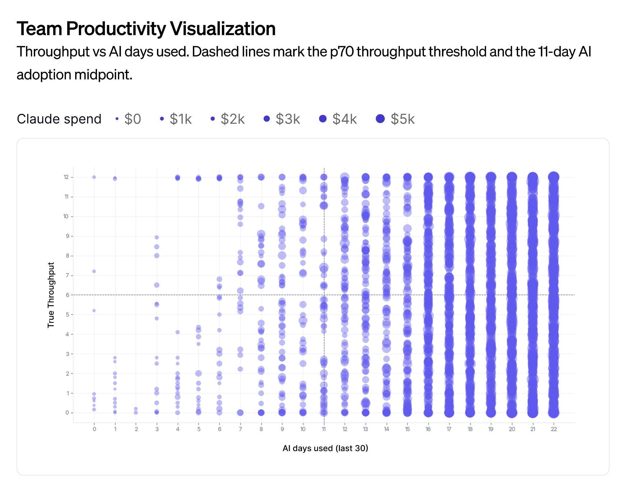
That creates four zones:
Exploring (bottom left): Lower AI adoption, developing throughput. Teams discovering what problems AI might solve.
Learning (bottom right): High AI adoption, building throughput. Expected pattern as teams explore different applications over 2-3 months.
Efficient (top left): High throughput without heavy AI adoption. Some roles and workflows don’t need AI.
Amplified (top right): High AI adoption, high throughput. Patterns here show which applications create real impact.
Each dot on the chart represents an individual. Bubble size reflects spend. And the views are drillable: from the entire organization down to a business unit, a team, and ultimately an individual manager’s direct reports.
What the data revealed
Since rolling out the dashboard, the results have been striking. Initially, as one might expect with newly introduced tooling, the bottom-left quadrant was packed, meaning that a large portion of our engineering organization hadn’t touched AI tools at all. Within four months,, that quadrant was nearly empty; less than 1% of the organization remained in the low-AI, high-throughput zone. It’s been exciting to watch the whole organization shift on this.
“Less than 1% of the organization remained in the low-AI, high-throughput zone.”
We also saw some things in the data that confirmed what we’d hypothesized. For example, the group seeing the biggest throughput gains were our senior and principal engineers, at ~20-30% above what other roles saw. That’s intuitive, but it was interesting to see it in the data. Senior engineers already have strong instincts for where AI can help and where it can’t. They were often quicker to identify high-leverage opportunities and incorporate the tools into existing workflows.
One pattern caught us off guard: managers and directors started writing code again. Our leadership population started doing more direct hands-on coding. They have more assistants, they can multitask better, whatever the reason, it’s a clear trend. That pattern extends beyond engineering: our product managers and designers have started leaning into AI tools too, getting comfortable with the terminal, creating digital artifacts, and contributing in ways that show up in delivery metrics. When we started this, it wasn’t what we anticipated, but it’s a trend that is now more commonly observed and discussed.
How managers use the dashboard
The real value of the dashboard is the quality of the conversations the data enables.
For managers, the first question often focused on adoption: “How do we get you from left to right?” Are you using it daily, is it part of your workflow, or are you still finding your footing with it? But over time, the conversation became less about adoption itself and more about impact. Where is AI helping? Which workflows are working well? Where is it creating leverage, and where is it not?
When a manager saw an engineer with high AI usage but flat throughput, the right response wasn’t to question the spend. It was to ask what they were working on; maybe they were ramping up on new AI workflows, or in a role where their AI-assisted work didn’t produce code commits. One example is heavy operation roles where productivity didn’t always result in commits into GitHub.
The best way to head off gaming or surveillance concerns is proactive communication. Don’t let people fill in the blanks on what the dashboards are for or why they exist. Be very clear. The dashboard is a conversation starter, not a performance management system. If teams interpret the dashboards as a tool for punishment or reward, they’ll have every incentive to game the numbers.
“The dashboard is a conversation starter, not a performance management system.”
At UKG, the framing has been consistent from day one: the dashboard exists to help managers empower their team, understand the work, understand how AI is being applied to that work, and help people lean into a new way of working.
Keeping AI spend in check without leading with cost
AI spend is visible on the dashboard, but it’s deliberately not the headline metric. It’s an awareness layer, something managers should be conscious of, not something that drives the conversation.
We use what I call “circuit breakers”; daily budget controls that flag when usage spikes above a threshold. But we haven’t yet landed on a firm benchmark for what reasonable per-engineer spend looks like.
The range is just too wide right now. Some teams are considering multi-agent orchestration and long-running loops that transform an entire codebase overnight. Others are using AI to finish a feature today. At this stage, it’s really hard to generalize.
I expect spending patterns will stabilize as the initial learning ramp flattens. Your first couple of prompts will probably be expensive. You’re still learning how to use the models correctly, you’re playing, you’re understanding how to use this radical new thing. But in as little as a few months, you will start to see averages form. We’re still in an experimentation phase, and for now, the approach is pragmatic: watch carefully, trust manager judgment, and make sure the investment is going toward the right outcomes.
What comes next
We’re already thinking about the limits of what the current dashboard captures. TrueThroughput is powerful for teams that ship code, but it misses productivity gains in operations, SRE, and other roles where AI is being used to correlate incidents, search logs, and accelerate incident resolution, work that never ends up in a pull request.
We have teams where an engineer uses AI to search past incidents during a live outage and correlate similar patterns to get to a resolution faster. That’s enormously productive, but it won’t show up in throughput. We’re trying to think through what the next level of digital footprints looks like, the metrics that capture the full picture of AI-enabled productivity, not just the code-commit slice of it.
The dashboard is a living system designed to evolve as we learn more about what effective AI-enabled engineering looks like.
Final thoughts:
For engineering leaders at other organizations who haven’t yet started measuring AI adoption, my advice is simple: Measure something. Metrics you have access to might differ, but collect some form of data, figure out what makes sense for your organization, and don’t make it a binary decision based on the data itself. The data should enable leaders to have further conversations.
That’s an important takeaway: The tools are powerful, and the data is illuminating, but the transformation happens in the conversations between managers and their teams.
If you have questions about UKG’s approach, or just want to hear more from Thomas, make sure to follow or connect with him on LinkedIn.
That’s it for this week. Thanks for reading.
-Abi
The spend-as-awareness-layer decision is the one that doesn't travel. It works at UKG because your engineers ship your product, meter and outcome sit inside the same P&L, so a manager can afford to look at consumption second.
In a consultancy the meter is either billed to the client or it eats the margin. The moment consumption pricing meets a fixed-scope engagement, spend stops being an awareness layer and becomes a contract term, and the coaching conversation gets much harder to keep separate from the commercial one. Curious whether you've seen the range narrow at all since, or whether the learning ramp is still the dominant variable.